
15 Website Features Users Actually Hate
Some Universal Dislikes - Plus My Pet Peeves
Posted by Charlie Recksieck
on 2026-01-29
It's allowed sites to get in users' faces to subscribe or push some other "ask." It's been great for advertisers.
But that doesn't really mean that user experience has improved that much.
Here's a list of 10 things that became fashionable for web designers and corporate sites at some point that people just don't enjoy. Some of these are huge personal pet Internet peeves of mine, and some are more researched widespread annoyances.
1. Autoplay Videos and Audio
Thankfully, this has gone out of style a bit. Web designers have been made aware that this pushes people away. Autoplay media feels intrusive and often causes people to leave immediately, especially on mobile devices or in quiet environments.
2. Aggressive Pop-Ups
We've all gotten a little inured to these. But everybody has their limit and it's lower than you might think.
I'm not saying that doing this for something important like email address capture popups, but restraint really matters. Bonus points if you can do this in a way that doesn't interfere with whatever the user is reading when that pops up.
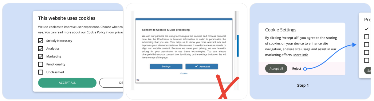
3. Cookie Acceptance Tricks
The General Data Protection Regulation (GDPR) in 2018 required that website specifically ask for explicit acceptance or denial of cookies and tracking on a website. It was very well-intentioned and seemingly a great idea.
But in practice, many cookie consent banners are less about choice and more about fatigue, hoping you'll click "Accept All" just to make them go away. The approve button is usually bright, friendly, and enormous, while "Reject" is buried like an apology no one expects you to read ... and it requires you to scroll and spend time specifying which classes of cookies or tracking you want to reject. YES is easy and NO is complicated.
Some sites technically comply with the law while doing everything possible to nudge you toward maximum tracking. When consent is designed to be easier than refusal, it’s deceitful and we all know it.
4. Slow Page Load Times
Large images, slow scripts, and bloated frameworks frustrate users. One second doesn't sound like much; one second is enough to push users away. There are lots of page-loading-speed site evaluators out there.
Designers fall in love with design. And lots of them have the fastest internet connection and great computers with kick-ass processing speeds while they're designing. As a result, they think their cool elements load great and look terrific. They're in a bubble.
Maybe don't totally gear your designs towards dial-up speed, but be mindful and take it easy when it comes to bogging down a page. Also, observe best practices when it comes to having server-side code and client-side scripts; bad practices there can slow things down.
5. Forced Account Creation
Yes, people need to pay for what they get. You can only give so much of your business away for free.
But you can't put everything behind a paywall. Who's gonna sign up or enroll if you don't prove your value publicly first? If you don't, then your site really is doing ZERO marketing. Making users register before they can read - or buy - is a major turnoff.
Additionally, unless it's really a site they're going to value - people don't want another password to manage.
6. Pre-Checked Consent Boxes
Companies and designers have instentionally made their checkboxes for marketing emails, data sharing, or add-ons are already selected by default. The ethos of the Internet and email is "opt-in", yet lots of sites just can’t do the right thing ethically.
-
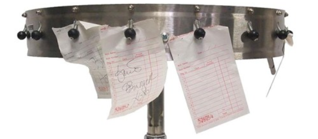
7. Confusing Navigation
Clever-but-unclear labels and inconsistent navigation structures leave users lost. If visitors can't find what they want quickly, they won't try harder.
Years ago I was doing research on sites for a startup I had. We were tracking how many clicks and how long it would take users to find a "Contact Us" link; some of the results were appalling. But the weirdest one by far was Denny's site. There were no text links for anything about email or contact. Instead, they had an animation of a food order wheel (real one shown below) that you needed to know to mouse over quickly to rotate to the visual paper check that said "email."
8. History Manipulation
History manipulation on the web refers to the ability of a website or web application to change the browser's history stack or URL without forcing a full page reload.
But it also has the awful (for users, sneaky for the website) effect of not being able to use the Back button to escape. If you hit back on this site, you end up on the same site. It sneakily increases the hits numbers on their analytics - which makes designers or marketers there look good, but terrible for user experience.
It could be done by honest mistakes and poor design. It happens more when they try to make a webpage act as an app. But it's terrible.
I wrote about it here: https://www.plannedscape.net/blog-details.php?BlogPostID=139.
9. Won’t Let You Leave
This is the website equivalent of the clingy boyfriend or girlfriend who won’t accept a breakup. The saddest thing they do is the good old fashioned snarky guilt trip where decline buttons labeled with guilt-inducing language like: "No thanks, I hate saving money".
Just as bad and more legally objectionable is when their "Cancel subscription" link is buried deep in settings, grayed out, or split across multiple pages; Users can easily sign up in one click, but must hunt to leave - intentionally increasing churn resistance.
10. Chat Widgets That Interrupt
Chat tools can be helpful, but auto-opening chat windows or constant nudges feel intrusive. It's terrific when a website has a solid chat feature. But most users prefer to ask for help when they're ready.
We all know how to find a chat in the lower-right corner. Just don't have it pop up and get in people's way when they're reading or using the site.
11. Infinite Scroll Without Structure
I've hated infinite scroll for a long time. It's the kind of thing you see on an influencer's page or music review blogs.
It's where new items (posts, images, products) appear automatically as you scroll down. No "Next Page" button is needed. It's done with AJAX or JavaScript fetching new content from the server without reloading the page.
All I've got to say is: Yucch! Leave this one for the people at Pinterest.
12. Poor Mobile Experience
We've all seen it. I shouldn't need to draw attention to this.
Tiny buttons, unreadable text, and layouts that break on phones instantly damage credibility. When designers give a hard value to items on a page - like 150 pixels width for an image, or a percentage (of page width) value for width - it looks great on the designer's wide monitor, but unreadable on a phone.
Mobile usability is no longer optional. It's expected.
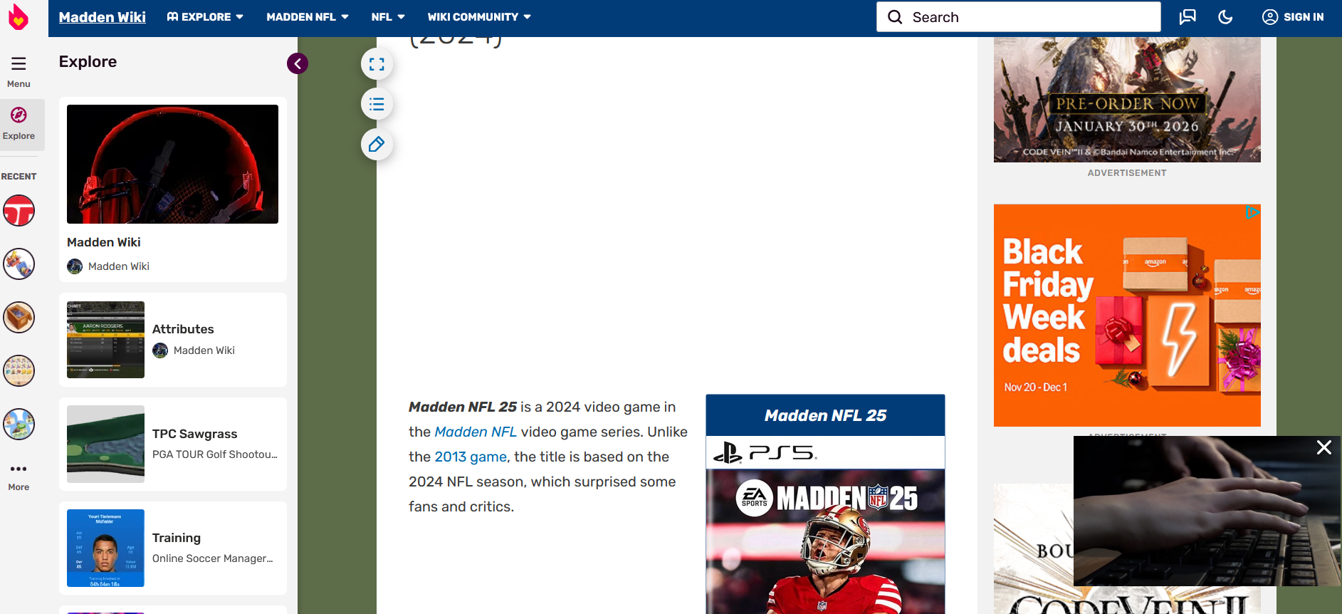
13. Overly Busy Design
We also know this one, all too well. Too many colors, animations, ads, and competing calls to action overwhelm users.
Additionally, design experts and scientists have claimed that a web page should only have TWO dominant colors (besides black, white, and greys). Anything more is lost on visitors and unconsciously creates cognitive overload.
Lastly, designers get too cute with ads that change size. They're trying to keep the page looking active to keep users there. But when lame sites do this, the expanded ads move the page down, making it impossible to continue to read text. Newspaper sites: you're on notice!
Look at this Fandom wiki; this article is diplaying two small sentences of text from the article being shown and that’s it. This is just gross:
14. Misdirection via Visual Hierarchy
This one isn’t even subtle. It’s the dark art of making the thing you don't want clickable enormous, colorful, and friendly-while hiding the thing you do want behind faint grey text.
It's not that users "chose" the upsell or newsletter; it's that their eyes were gently marched there by design choices pretending to be neutral. A large, bright "Accept All" button and a tiny, low-contrast "Manage settings" link. That shady practice works.
15. Fake Urgency, Pretending
If you're a one-person consultancy, don't pretend you're a large 80-person company. If you're a small rock band, don't pretend you're on the Billboard charts. You're not fooling anybody.
Countdown timers that reset, "Only 1 left!" messages, or misleading alerts erode trust.
Everybody sees through this. This seems like a perfect opportunity to use a little humor and honesty; people will respect that. If you're a one-person consultancy, people might prefer your individual attention. If you're a struggling rock band, people might love supporting an artist on the ground floor.
What Does This Mean For Your Site
Generally, users want websites that are fast, respectful, and easy to use. Removing these annoying features can do more to improve a site. Less is more. The best user experience is usually the simplest one-where nothing gets in the way of the content or task at hand.
Think over what people really want on your site, match that with what info you want to push plus your calls-to-action - anything else that is not accomplishing that purpose, get rid of it.
Not only is The Golden Rule (don’t design a site that you wouldn’t want to visit) the ethically right thing to do; too many tricks will turn users off and get people committed to not using your services out of spite.