
If It Ain't Broke, Don't Rebrand It (Part 1)
Congratulations, You've Ruined Your Brand
Posted by Charlie Recksieck
on 2026-11-12
In 1981, Datsun was the second-most-popular imported-car make in the U.S. Nissan's American subsidiary reportedly found that only 13% of U.S. consumers knew the Nissan name. They chucked their U.S. brand identity overboard. A 1987 Los Angeles Times article described the change as a marketing blunder that was still undermining sales six years later.
I was thinking about that here in San Diego the other day when a long-established bar and music venue in Ocean Beach called Winston's was bought and would be changing their name. Why?! Bar sales are difficult to sustain year after year, even more so for music venues. And this is one of the few juggernauts with regular music audiences even on Mondays. They're ready to blow up that name?
The Oldest Mistake in the Book
Companies can spend decades establishing recognizable brands. Customers learn the product name and packaging in those decades.
Then, seemingly out of nowhere, management decides the brand needs a makeover. Whoops.
Sometimes change is necessary. But just as often, companies dismantle valuable brand recognition without a compelling reason.
The problem isn’t rebranding itself. It’s management treating an established brand as an outdated corporate asset rather than something valuable that customers have helped build.
There are some entertaining cases where a company already had something that worked, changed it anyway, and frequently had to backpedal. Let's open up a can of schadenfreude to enjoy some spectacularly avoidable corporate mistakes.
The Hall of Fame of Branding Unforced Errors
Let’s try to summarize what the original brand was, what management changed, why it changed, and what happened afterward.
Tropicana: Making the Orange Juice Harder to Recognize (2009)
The change: Tropicana replaced its orange-with-a-straw packaging with a minimalist design featuring a glass of orange juice.
Why it belongs: The redesign made a familiar product less visually distinctive. If it was me, I totally would have switched brands just because I couldn't find the familiar box. Customers reportedly struggled to identify it; sales declined, and the company eventually had to restore the previous packaging.
The company had already spent decades teaching customers what its product looked like. Why discard that recognition for a design that looked more generic? According to sciencedirect.com, sales dipped by 20% and a Univ. of Florida study said it cost them $27 million.
Gap: The Logo Nobody Asked For (2010)
The change: Gap replaced its familiar blue-box logo with a new design featuring a smaller blue square and different typography.
Why it belongs: The redesign provoked immediate criticism and was withdrawn within approximately a week.
What was the original logo failing to accomplish? Did the company have a brand problem, or did someone simply want a new logo?
MGM Grand: The Lion at the Door
The change: The MGM Grand hotel and casino opened in Las Vegas in 1993. After the original 1970's MGM casino suffered a deadly fire in 1980, it was then sold to Bally's. In the 1993 reboot, the casino entrance featured a giant lion’s head and mouth.
The problem: The design was reportedly off-putting to some Chinese visitors, for whom entering through a lion’s mouth could carry an unfavorable cultural association. It apparently even signaled bad luck, which is a bad look for a casino.
The designer and executives thought it looked cool. But that's not who's walking through the doors. And you can't throw off Chinese clientele in a place that makes millions off of slot machines and Pai Gow poker.
RadioShack: The Shack (2009)
The change: RadioShack experimented with using the name "The Shack" in its marketing.
Why it belongs: The effort attempted to make an established electronics retailer sound more contemporary and approachable.
Let's face it; RadioShack was already circling the drain by this point, whether it was called The Shack or RadioShack. And is a younger demographic ever going to get excited about RadioShack? A perfect example of a cosmetic branding change when the underlying business needs attention.
WeightWatchers to WW (2018)
The change: WeightWatchers adopted the shorter name WW as part of an effort to broaden its positioning beyond weight loss.
Why it belongs: The new name was less immediately descriptive of the company’s established service.
When does repositioning a brand broaden its appeal, and when does it throw away useful clarity? Anybody knew what WeightWatchers did. WW? That's a different matter.
Jaguar: A Radical Identity Change (2024)
The change: Jaguar launched a radically different brand identity and the "Copy Nothing" campaign, emphasizing fashion-forward imagery and abstract visual branding rather than prominently showing its cars.
Why it belongs: The campaign generated widespread attention and criticism because of the contrast with Jaguar’s established automotive identity.
If you can't show your sports car in your ads, then you should make better sports cars. The design of the Jaguar is a huge part of their appeal. Why junk it?
Blueland - The Green Brand That Was Somehow Blue
The decision: An eco-friendly cleaning brand that uses blue rather than relying exclusively on the green commonly associated with environmental products.
Why it belongs: Is this a documented failure? No. It was either a smart counter-green offering on the environmental shelves, or an unforced error.
As we're about to see, color matters.
The Gap Between a Color Mistake and a Branding Mistake
Color counts so much.
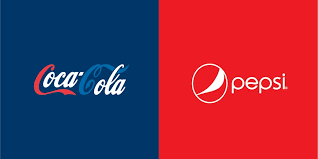
Designer Paula Rupolo explores the power of branding by swapping the signature colors of competing companies. In her work, Coca-Cola gets Pepsi's blue, Starbucks trades its green for Dunkin's orange and pink, and FedEx takes on UPS's brown and gold. The results can feel strangely wrong, even when the logos and company names remain recognizable. It's a simple demonstration of how deeply color becomes associated with a brand, shaping our perception before we've even read the name.
Look at these mismatched logo colors. They're freaking me out:
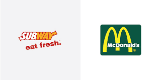
Maybe more sophisticated shoppers recognize many more things than colors. But if my wife tells me to get something at the store I don't normally get, my first question is: "What's color is the box?"
* * *
Cliffhanger
OK, let's stop here. Come back next week for the exciting conclusion starting on Nov 19, 2026.
